How to Make Your Business Stand Out with Signage Effectively in a Competitive Market
July 2, 2025
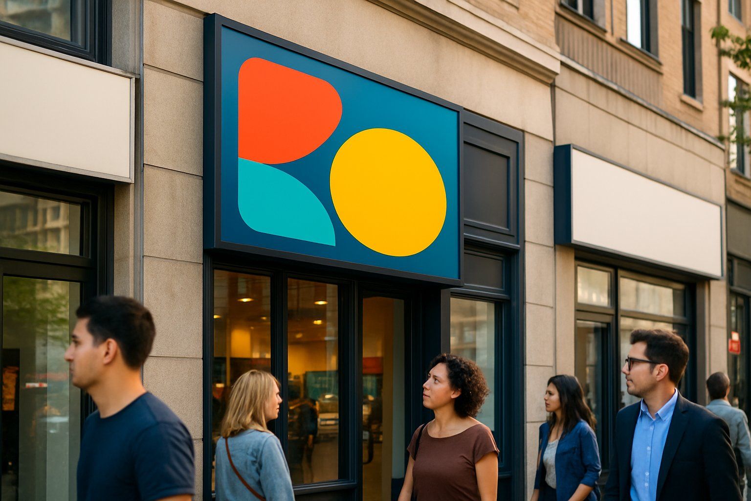
Making a business stand out starts with effective signage that grabs attention and clearly communicates the brand’s message. Well-designed signs help customers recognize a business quickly and create a strong first impression.
This can boost foot traffic and increase sales.
Signs should be easy to read, visually appealing, and unique to capture interest. Choosing the right colors, fonts, and materials plays a big role in making a business memorable.
Thoughtful placement and lighting also improve visibility and attract more customers.
A strong signage plan fits the business’s style and budget while supporting marketing efforts.
Combining creativity with practical design ensures the sign works long-term and draws the right audience.
Key Takeaways
- Effective signage improves business recognition and attracts customers.
- Clear design and quality materials help signs stand out.
- Good signage supports marketing and fits the business budget.
The Power of Signage for Business Success
Signage plays a crucial role in shaping how customers see a business. It impacts how quickly people notice a store and remember its brand.
Well-designed signs can create a strong image that helps a business compete and grow.
Why Effective Signage Matters
Effective business signage helps attract attention in busy areas. Clear and readable signs inform potential customers about what the business offers quickly.
This saves time and reduces confusion. Good signage also guides people to the business location.
This convenience can increase foot traffic. Signs that stand out from others nearby give a business a competitive edge.
Signs that are updated and well-maintained show professionalism and care.
First Impressions and Lasting Impact
The first impression a business sign creates matters. People often decide within seconds if they want to enter or ignore a store.
A unique and attractive sign invites curiosity and trust. A lasting impression comes from consistent quality and design.
Signs that clearly show the business style and values make customers more likely to return. Poor or damaged signs can cause negative feelings and reduce visits.
How Signage Drives Brand Recognition
Business signs are a key tool for building brand recognition. They display logos, colors, and fonts that remind customers who the business is.
Consistent signage across locations and marketing materials helps reinforce the brand in people’s minds. When customers see a familiar sign, they connect it to their past experiences with the company.
Signs placed in strategic locations increase visibility. This repeated exposure leads to stronger brand recognition and loyalty.
Crafting Your Unique Signage Strategy

Creating an effective signage plan calls for clear ideas about what the business wants to show and who it aims to reach. Each sign should reflect the brand’s core values and goals to attract the right customers.
Planning will help turn a simple sign into a strong part of the marketing strategy.
Understanding Your Brand Identity
A business’s brand identity includes its colors, fonts, logo, and overall style. These elements must appear clearly on every sign to create a memorable sign that stands out from competitors.
Consistency helps people recognize the business quickly. Businesses should list key traits of their brand—such as friendly, professional, or modern—and make sure the sign shows those traits.
For example, a playful font suits a kids’ store, while sleek lettering matches a tech company. When the sign reflects the brand identity well, it becomes a powerful tool in attracting customers.
Setting Goals for Your Business Sign
Before designing a sign, businesses should decide what the sign should do. Common goals include attracting more foot traffic, promoting a new product, or increasing brand awareness.
Each goal will affect the sign’s size, placement, and message. For example:
- To attract customers nearby, a big, bright sign near the entrance works well.
- To promote a special offer, incorporating a clear call-to-action, like “50% Off Today,” grabs attention.
Setting specific goals ensures the sign is focused and effective.
Targeting the Right Audience
A sign should speak directly to the people the business wants to reach. This means understanding the audience’s age, interests, and needs.
For example, a café near a school might use colorful, fun designs, while a law office chooses professional and simple styles. Knowing where the target audience spends time helps place signs in the best spots.
Locations with heavy foot traffic of the ideal customers will bring better results. The right message and look make the sign memorable and part of a smart marketing strategy that works.
Design Elements That Make Your Sign Stand Out
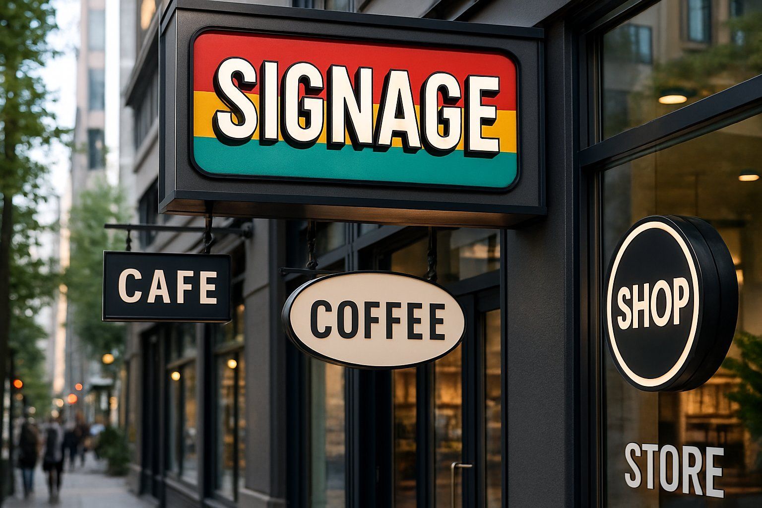
Effective signs use clear colors, readable fonts, and interesting shapes to attract attention. Choosing the right balance of these elements helps the sign become noticeable and easy to understand from a distance.
Mastering Color and Contrast
Color plays a big role in catching the eye. Bold colors like red, yellow, and blue grab attention faster.
High contrast between the background and text is critical. For example, white or light text on a dark background is easier to read.
Using contrasting colors also improves visibility in different light conditions. Avoid using too many colors, as it can make the sign confusing.
A simple color palette with strong contrast is more effective for quick reading and lasting impact.
Selecting the Right Typography and Font
Typography means the style of the letters on a sign. Using clear, simple fonts like Arial or Helvetica helps people read the message quickly.
Avoid fancy or script fonts because they can be hard to read from far away. Fonts should be large enough to read at a distance.
Bold fonts increase visibility and create a strong impression. Consistency in font style and size across the sign improves overall design and makes the message clearer.
Utilizing Shapes and Graphics
Shapes and graphics give a sign personality and help it stand out. Unique shapes, like rounded edges or custom outlines, catch the eye better than plain rectangles.
Simple geometric shapes like circles or triangles can add interest while keeping the design clean. Incorporating graphics such as logos or icons also makes signs more recognizable.
Graphics should be simple and related to the business to avoid clutter. Balanced use of shapes and images helps guide the viewer’s eye and supports the message.
Optimizing Visibility and Readability
Signage must catch attention quickly and be easy to read from a distance. This depends on size, font choice, and where the sign is placed.
Proper design helps a business attract more foot traffic and communicate its message clearly.
Choosing the Appropriate Size and Scale
The size of a sign should match its viewing distance. Larger signs work best for locations visible from far away, like highways.
Smaller signs suit places where people are closer, such as inside a mall. Scale also matters.
The size of letters and images needs to be balanced with the overall sign size to avoid clutter. For example, letters should be at least 1 inch tall for every 10 feet of viewing distance.
Bold fonts and clear colors improve size effectiveness. Avoid using too many fonts or overly decorative styles.
Simple, large text helps ensure the sign is readable and grabs attention.
Ensuring Legibility from a Distance
Legibility means letters and words are clear and easy to read at a glance. Choose high-contrast colors like black on white or white on dark backgrounds.
Avoid color combinations that blend or cause eye strain. Font style affects legibility.
Sans-serif fonts, like Arial or Helvetica, are often easier to read from far away. Avoid script or thin fonts that can blur when viewed quickly.
Spacing between letters and words also helps. Tight spacing can make words hard to distinguish.
Proper spacing improves readability and keeps the message clear.
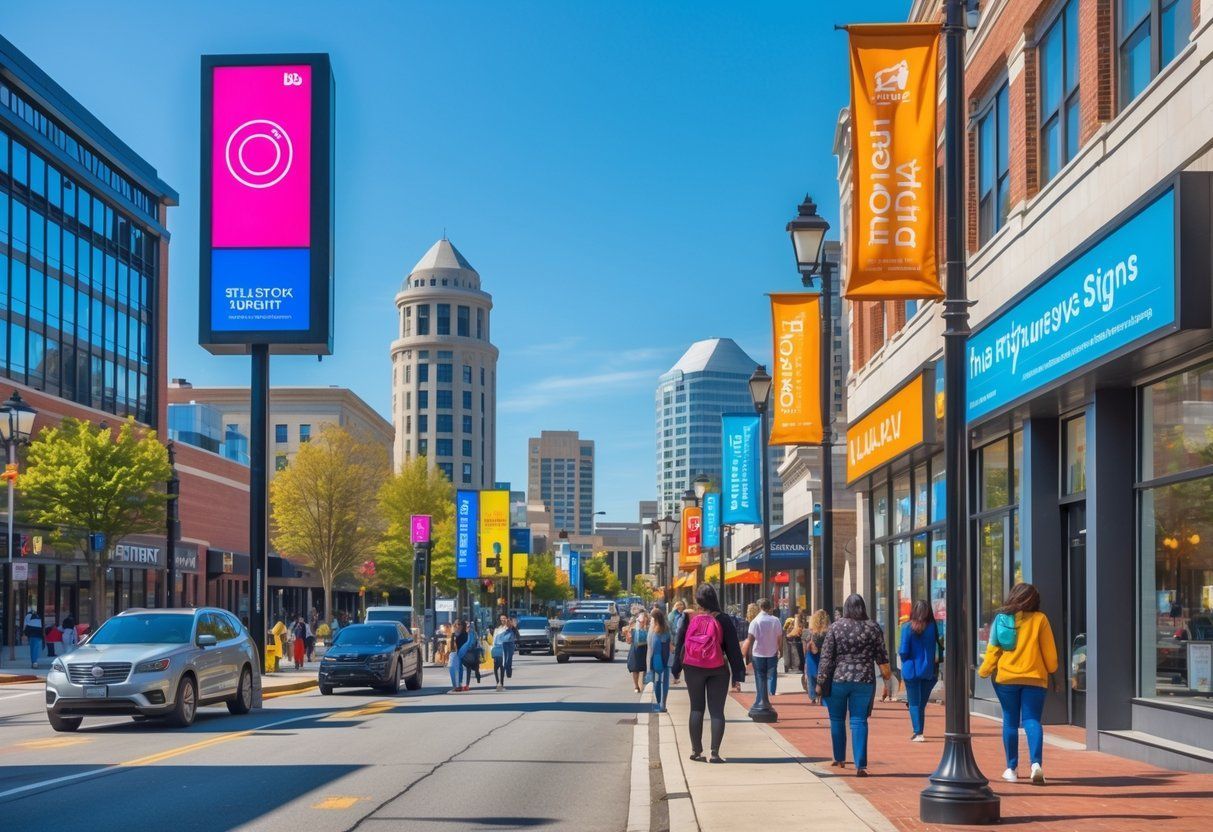
Strategic Placement for Maximum Exposure
Placement impacts who sees the sign and how easily it can be read. Signs should be placed where the most foot traffic or vehicle traffic passes by.
Eye-level placement works well for pedestrian areas. Consider lighting and background when placing signs.
Avoid putting signs where shadows or bright light might hide the message. Reflective surfaces or uneven backgrounds can reduce readability.
Position signs so they face the main flow of traffic. Signs that require viewers to turn their heads or stop often get ignored.
Straightforward placement maximizes visibility and effectiveness.
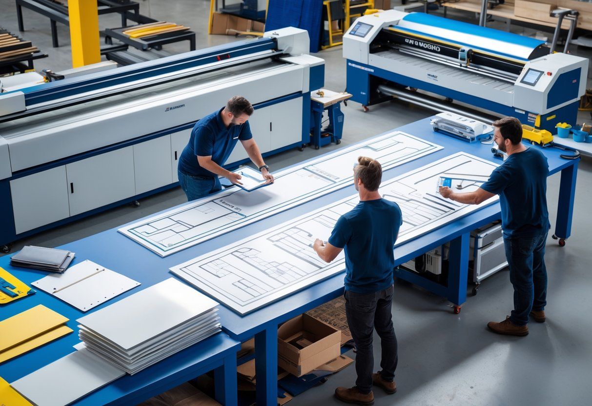
Selecting High-Quality Materials and Finishes
Choosing the right materials and finishes is critical to making signage effective and lasting. The focus is on durability, suitable materials for different locations, and how these choices impact the sign’s appearance and lifespan.
Durability for Outdoor Signage
Outdoor signs face weather, sunlight, moisture, and temperature changes. Materials must resist fading, rust, and warping to stay clear and readable.
Metal signs , like aluminum and stainless steel, offer strong resistance to corrosion and damage. Protective coatings such as powder coating or UV-resistant finishes help prevent color loss and extend the life of outdoor signs.
Without proper durability, signs will need frequent replacement, increasing costs and reducing visibility.
Exploring Quality Materials Options
High-quality materials vary based on the sign’s purpose and exposure. Popular options include:
- Aluminum: Lightweight, rust-proof, and sturdy.
- Acrylic: Clear, smooth, and good for bright colors.
- PVC: Cost-effective and weather-resistant for short-term use.
Finishes also affect durability and look, such as matte, glossy, or textured surfaces. The choice depends on branding needs and environmental factors like wind or rain.
Materials for Indoor Versus Outdoor Use
Indoor signage can use less durable materials because they avoid harsh weather. Foam board, vinyl, or acrylic are common for indoor signs.
These allow for vibrant colors and sharp graphics but last less outdoors. Outdoor signs demand tougher materials like metals or treated plastics.
Weatherproofing and thickness are major factors outdoors. Using the right material prevents damage and helps maintain the sign’s quality and readability over time.
Types of Signage to Enhance Your Business
Signage comes in many forms that can help a business attract attention and communicate its brand clearly. Different types serve different purposes, from creating a unique identity to updating customers with timely information.
Choosing the right mix can improve visibility and customer engagement.
Custom Signs for Brand Differentiation
Custom signs are designed specifically for a business’s brand. They use unique shapes, colors, and logos to make a business recognizable.
A well-made custom sign can set a business apart from nearby competitors. These signs can be made of materials like wood, metal, or acrylic.
They often include features like 3D lettering or backlighting for better visibility. Custom signs are good for storefronts, building entrances, and interior branding.
Using a consistent style on all signs helps build trust and brand recall. It also shows professionalism and care about the business image.
Digital Displays and LED Signs
Digital signage is a flexible way to share messages that change often. LED signs use bright lights that work well day or night, even in bad weather.
They easily catch the eye of passersby. Digital displays can show promotions, menus, or real-time information.
They allow quick updates without needing a new physical sign. This saves time and money over printed signs.
LED signs can be mounted outside or used inside stores to highlight offers. Because they are programmable, businesses can tailor messages to different times of day or events.
This keeps content fresh and relevant.
Window Graphics and Banners
Window graphics use vinyl or decals to add images or text to glass surfaces. These signs enhance windows without blocking light.
They can advertise specials or tell a company’s story. Banners are large, printed signs made of fabric or plastic.
They are easy to move and great for sales, events, or seasonal changes. Banners often use bold colors and simple words for quick viewing.
Both window graphics and banners are cost-effective ways to boost curb appeal. They can be designed to match branding and refreshed regularly to attract attention.
These options work well for both temporary and semi-permanent needs.
| Sign Type | Key Features | Best Uses |
|---|---|---|
| Custom Signs | Unique design, durable materials | Brand identity, storefronts |
| Digital Displays | Bright, programmable, changeable | Promotions, menus, alerts |
| Window Graphics | Transparent, decorative vinyl | Window branding, ads |
| Banners | Large, portable, bold colors | Sales, events, seasonal |
Creative Lighting Solutions for Memorable Signs
Lighting can transform a simple sign into something attention-grabbing and easy to read. Using bright, clever light setups helps businesses stand out both day and night.
Different lighting styles serve different purposes and suit various business types.
Backlit and Neon Signs
Backlit signs use lights placed behind a surface, making letters or logos glow softly. This method highlights details without glare.
It works well on signs made from materials like acrylic or metal. Backlit lighting is energy-efficient and lasts long, which keeps maintenance low.
Neon signs use glowing tubes filled with gas to create bright, colorful light. They are popular for their vintage look and strong visual impact.
Neon is ideal for businesses wanting a retro or artistic style. Bright neon colors catch attention, even from a distance.
Enhancing Visibility after Dark
Good lighting makes signs visible and readable after sunset. Using strong, focused LED lights around a sign can prevent dark spots and shadows.
This is critical for businesses that operate late or want to attract evening foot traffic. Motion-activated or timer-controlled lighting saves energy while ensuring the sign is always lit during busy hours.
Using warm white or cool white LED bulbs can affect the mood created by the sign’s colors. Properly chosen lighting boosts safety and helps a business look professional at night.
Cost-Effective Signage and Budget Planning
Planning a budget for signage means finding the right balance between cost and impact. Choosing materials and design carefully helps keep expenses low while still making the business visible and appealing.
Balancing Quality and Affordability
Businesses should focus on signs that offer good quality within their budget to avoid frequent replacements. Vinyl banners, foam boards, and simple LED signs are options that provide clear visibility without high costs.
They should compare prices from several suppliers and ask for samples to check durability and appearance. Basic designs often cost less but can still attract attention if well placed.
Investing in professional design services can improve the sign’s effectiveness without adding too much to the budget.
Long-Term Value of Durable Signage
Spending more upfront on materials like aluminum or acrylic can save money over time. Durable signs resist weather damage, fading, and wear, reducing the need for repairs or replacements.
Proper installation also extends a sign’s life by preventing damage. Businesses should weigh long-term savings against short-term costs when choosing signage.
Integrating Signage Into Your Marketing Strategy
Effective signage can draw people to a business, prompt them to take action, and build long-term connections. It needs to fit with the overall marketing plan to work well.
The right signs help attract customers, encourage engagement, and strengthen brand loyalty.
Maximizing Foot Traffic with Attention-Grabbing Signs
Signs should be visible and clear from a distance to attract more people. Bright colors, bold fonts, and simple messages work best.
Placement matters too—signs near entrances or busy streets bring the most attention. Using lighting or moving parts like digital screens can also help catch eyes.
Businesses should test different sign designs to see what draws the most visitors. The goal is to make it easy for people to notice and understand what the business offers at a glance.
Utilizing Calls-to-Action for Customer Engagement
Including calls-to-action (CTAs) on signs encourages people to act, such as entering the store or visiting a website. Examples include phrases like “Shop Now,” “Limited Time Offer,” or “Visit Us Today.”
CTAs need to be clear and easy to follow. Pairing them with arrows, phone numbers, or QR codes makes it simple for customers to respond.
These signs create a direct link between marketing and customer behavior and improve chances of turning visitors into buyers.
Leveraging Signage for Brand Loyalty
Consistent signage reinforces a business’s brand identity. Using the same colors, logos, and fonts as other marketing material builds trust with customers over time.
Signs inside and outside the store can remind visitors why they chose that business. Messages that highlight quality, customer service, or rewards programs encourage repeat visits.
Well-designed signs contribute to a positive customer experience, which helps keep customers coming back.
Innovative Interior Signage Ideas
Creative signage inside a business can attract attention and help visitors navigate the space. Using different materials and styles adds character and supports the brand’s message clearly.
3D Lettering for Modern Appeal
3D lettering adds depth and dimension to interior signs. It can be made from materials like metal, plastic, or wood, which gives a high-quality, polished look.
These letters stand out from flat walls, making the business name or important messages more noticeable. They work well in reception areas or along feature walls where visitors first enter.
Lighting can enhance 3D lettering by casting shadows or highlighting edges, boosting visibility and style. The clean, modern appeal fits well with many business types, especially those wanting a bold but professional statement.
Chalkboard Signs for Flexibility
Chalkboard signs offer a versatile way to change messages often. They are perfect for businesses that want to share daily specials, events, or updates without printing new signs every time.
They add a rustic or casual vibe but can also be designed neatly for a professional look. Using bright chalk markers or artistic fonts improves readability and appeal.
Besides text, chalkboards can feature drawings or branding elements, making interior signs more engaging. They are an affordable and practical option for dynamic communication inside a business.
Frequently Asked Questions
Effective signage includes clear messaging, visible fonts, and eye-catching colors. Small businesses can focus on unique designs and local appeal to stand out.
Material quality and brand consistency both play a big role in making signs effective over time.
What are the key elements of effective and memorable business signage?
Clear, simple text is essential. Signs should use bold fonts and high-contrast colors for visibility.
Including a memorable logo or icon helps customers recognize the brand quickly.
How can small businesses leverage signage to compete with larger competitors?
Small businesses can use personalized designs that reflect local culture or values. Highlighting unique products or services in signs helps attract niche customers.
Placement near high-traffic areas also increases visibility.
What are some creative ideas for outdoor business signs that attract attention?
Using 3D elements adds depth and interest. Incorporating lighting, such as LED or neon, makes signs readable at night.
Signs shaped to match the business or product create a memorable look.
How does the quality of materials impact the overall effectiveness of business signage?
Durable materials like metal or weather-resistant plastics last longer. High-quality materials prevent fading and damage, keeping the sign professional.
Poor materials risk the sign quickly looking worn or outdated.
What role does signage play in brand consistency and recognition?
Consistent use of colors, fonts, and logos on signs reinforces the brand. Repeated exposure to uniform signage builds customer trust.
This consistency helps people quickly identify the business across locations.
What are the best practices for integrating digital elements into traditional business signage?
Digital displays should complement, not overwhelm, the main message.
Using digital signs for promotions allows easy updates.
Combining static and digital elements helps catch attention and share timely information.…
Choosing the right types of signs for advertising in Raleigh can make a big difference for businesses looking to attract customers.
Design and manufacturing of signs require careful attention to both visual appeal and durability. Creating effective signs involves choosing clear, legible fonts, bold colors, and innovative designs while selecting materials that withstand weather and time.
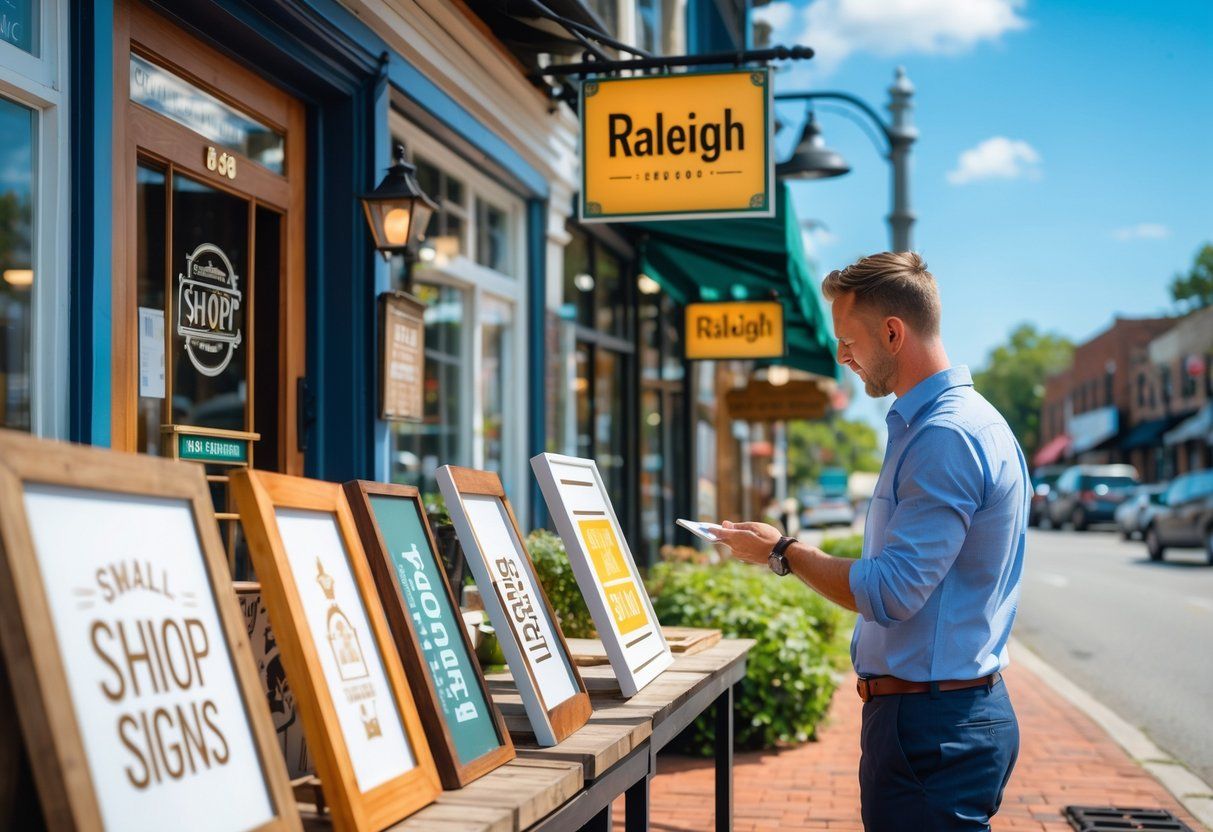
Choosing the right sign for a shop in Raleigh means picking one that clearly shows what the business offers while attracting customers. The sign should fit the shop’s location, style, and the kind of customers it wants to reach.

Building new structures in Raleigh comes with specific sign rules that every business or property owner must follow. To install any business sign visible from public roads, a zoning permit is required, and signs must meet city setback and placement rules.

Signs are made from many different materials, each with its own strengths and uses.
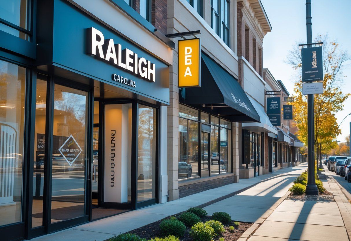
Raleigh businesses are choosing channel letter signs because they offer a clear and professional way to stand out. These signs are custom-made to fit a company’s brand and can be seen easily both day and night.
Choosing the right signs is important for any business in Raleigh. Signs help attract customers, share key information, and make a business easy to find.

Raleigh businesses and offices use a variety of sign styles to attract attention and communicate their brand clearly. The most popular sign types in Raleigh include channel letters, illuminated signs, and custom vinyl graphics, which work well for retail stores, office buildings, and events.